
Menu
A Comprehensive Introduction to the World of Typography – The Devil is in the Details
So you’ve just received a blog post from the writer you hired for your website. It looks good, so you load up your WordPress admin panel and get ready to post it.
But wait a minute! Before you hit that ‘publish’ button, have you thought about the typography you’re going to use? Have you thought about it for your website in general? Because even the best content in the world can live or die based on your choice of typeface. This is a highly detailed subject that can have a huge impact on the look and feel of your web design as well as the flow and impact of your posts and articles. Unfortunately, it’s also a subject that a lot of webmasters and bloggers simply overlook – and it costs them dearly.
When it comes to web design the devil is very much in the detail. While you might not find yourself thinking much about typeface as you brose the web, the fact of the matter is that it has an unconscious impact on readers that speaks to the tone of the article and the quality of the business. The right typeface can make you stay longer on a page or it can encourage you to click on another link. And when you get it perfect, it will bring together the whole design of the site and the message of the content into a cohesive whole.
To help you get better acquainted with this subject then, let’s go over the basics of typography. By the end you should be a veritable typophile…
What is a Typeface?
This seems like a pretty good place to start: what even is a typeface? A typeface is of course style of text you choose to write in but did you know there’s a difference between a font and a typeface? Specifically, the term ‘font’ refers to a precise choice of style – such as Arial Bold or Arial Narrow, whereas a typeface refers to the broader category – i.e. Arial.
That said, the terms ‘font’ and ‘typeface’ are often used interchangeably, as they will be for the rest of this article.
In either case, the objective of a typeface or font choice is to make your text look clear and easy to read while at the same time being consistent and reflecting the tone and subject of the text or publication (website in your case).
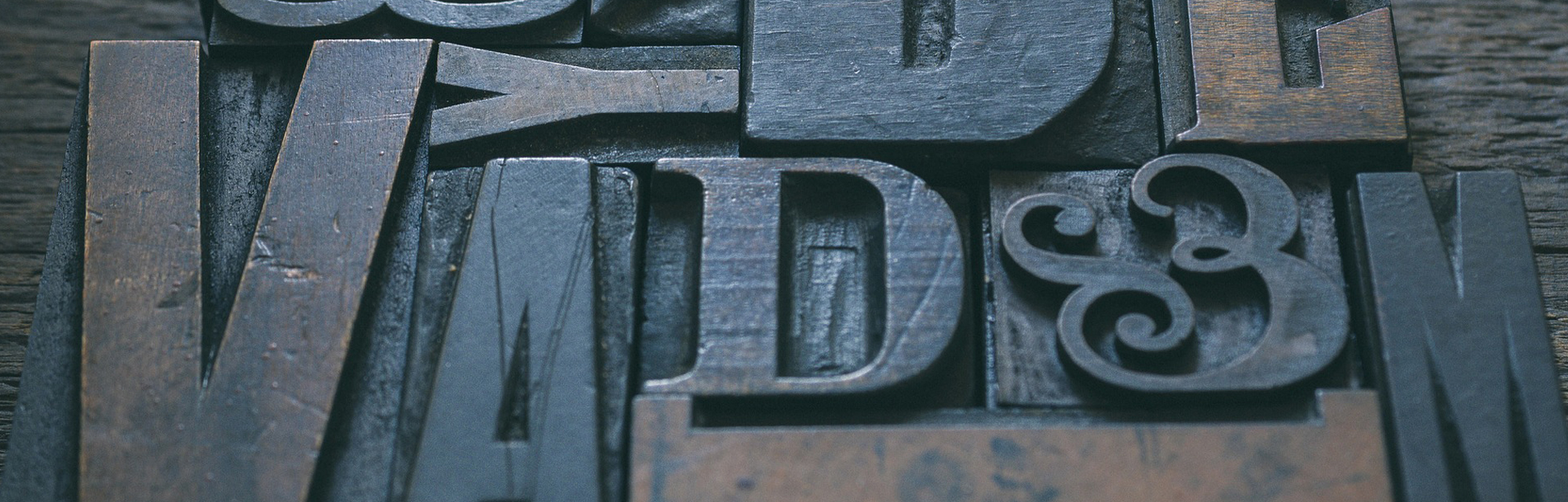
Typefaces were originally invented when analog printing first came to be. Originally, printing involved laying out letters that acted like stamps onto frames, rolling them in ink and then pressing them onto paper. This is where the term ‘printing press’ comes from. The typeface would dictate the shapes of these letters.
Today, typefaces serve pretty much the same role. Your aim in picking the right font is to make sure that your readers can easily see what’s on your page without undermining the message of your brand. What looks good on a screen though is somewhat different from what looked good using a printing press and so typography has had to evolve with the times. When the web was first introduced, resolution was an issue that needed to be considered when designing a typeface. Today that’s not such an issue but responsive web design is. In Google’s latest ‘mobile friendliness’ update, they mandated that sites must use text that is easy to read on a mobile device or suffer potential penalizations in mobile search results.
Aspects of Typeface
Size isn’t everything when it comes to typeface though. What’s just as important is making sure that your font is easy to read and that it’s fitting for the type of content you’re posting. If you run an online news site then you’ll probably want a serif font for instance. Let’s take a look at some of the different factors influencing the feel of a font.
Serif
One of the biggest distinctions that can be made between typefaces is whether or not they are ‘serif’ or ‘sans serif’. A serif font is basically any font that has feet and legs – like Times New Roman. These types of fonts were used very commonly in the creation of newspapers and look particularly good when printed on paper. The idea of the feet is to help draw attention to various strokes and thus make it easier to differentiate between letters. An ‘l’ (L) and an ‘I’ (i) look different for instance when you use a serif font.
For digital media however, serif fonts can actually end up having the opposite effect and make a page look a little unnecessarily cluttered. This is particularly true on mobiles with small screens. Recent design trends have moved very much in the direction of minimalism too and so sans serif typefaces tend to evoke more of a feeling of modernity and of the digital age.
If you run a news blog, then choosing a serif font might lend you prestige through association with print publications. If you run a hip design blog, then a sans serif font shows you know what you’re doing and you’re ‘current’.
Stroke Width and Weight
The stroke of a font refers to individual lines. In many modern fonts these remain a consistent width all the way through, whereas in some gothic styles and script styles (see below) the width can vary at different points.
The weight meanwhile refers to how thick the letters are overall. When you make a font bold you are increasing the overall weight. When you make a font with variable stroke widths bold though, all the different areas of the letter will increase proportionately.
Kerning
Kerning refers to the space between individual letters. A well designed font will consider this carefully, as well as the ‘border’ around the font which prevents the tail of the ‘g’ from overlapping the line underneath it for instance.
Kerning is a little more complicated than it might sound because the ideal space between different letters varies depending on the weight of that letter on each side etc. The objective of kerning is to make a page of text appear to be a roughly even distribution of black and white rather than having obvious patches of heavy text and areas of ‘light’ text.
One of the reasons that the Comic Sans typeface gets so much flack is that it lacks proper kerning. Or at least it is believed to – in fact the font was designed for lower resolution displays where the kerning made a lot more sense the way it is.
Kerning is just one example of why it’s so difficult to create your own unique font – and why it pays to get a professional in.
Slope
The slope of any given text refers to how slanted it is. While you can make most fonts italic, others are italic by nature.
Originally italics was invented as a way to fit more text onto a page without making it harder to read! Today it is used more often for emphasis.
Width
The width of typeface of course refers to its relative width compared to its height. This is important in graphic design because wider fonts often look better when used as long headers etc. Narrow fonts make more sense in side bars on websites.
Era and Style
Fonts vary in their style and can be grouped together in rough categories, often dictated by their era. Gothic fonts for instance are old-style fonts that wouldn’t look out of place in a horror film, whereas script fonts are fonts that look hand written (and often have a sharp slope). Modern fonts are those newspaper-style fonts with straight lines and serifs, decorative fonts are ‘over the top’ fonts that look like blood or fur and monotype fonts are fonts with uniform kerning (used for programmers).
When choosing your font you need to ensure that the era and style reflect your business. As mentioned earlier, sans serif fonts look the most modern and so are a good pick for online businesses. Meanwhile, script fonts are great for greeting cards and monospace fonts can unconsciously communicate that your site is about programming (if it is). Other font styles include old styles and transitional styles. Sometimes these categories are described as ‘flavors’.
How to Get Your Font Choice Right
So far you know that your font needs to be legible on all devices and that it needs to match the style and tone of your business. Remember the design maxim ‘communicate, don’t decorate’. In other words, a good font choice should say something about your business. At the same time, you shouldn’t sacrifice function for form.
For an appealing design you want to use more than one font but you shouldn’t use more than three. This might mean having one font for your text, one for your header and one for your subheader. The fonts you choose to combine need to work with one another. That means that they should be from a similar era and style. For example then you don’t want to choose a script font for your headers and then use a monotype for your text… it will just look bizarre.
That said though, you also need to avoid combining fonts that are too similar. You need to make sure that it’s clear you’ve purposefully chosen to use two different fonts otherwise it can look a little jarring.
Once you’ve made your decision on which fonts to use, you next need to carefully consider your size and color. These factors will have a big impact on the overall legibility and how readable and enjoyable your font is for your visitors.
To start finding fonts to use, check out ‘FontSquirrel.com’. That’s a great repository with a ton of free fonts you can use. Once you start playing with them, you’ll quickly see the difference it makes and you won’t look back!